Phase Three
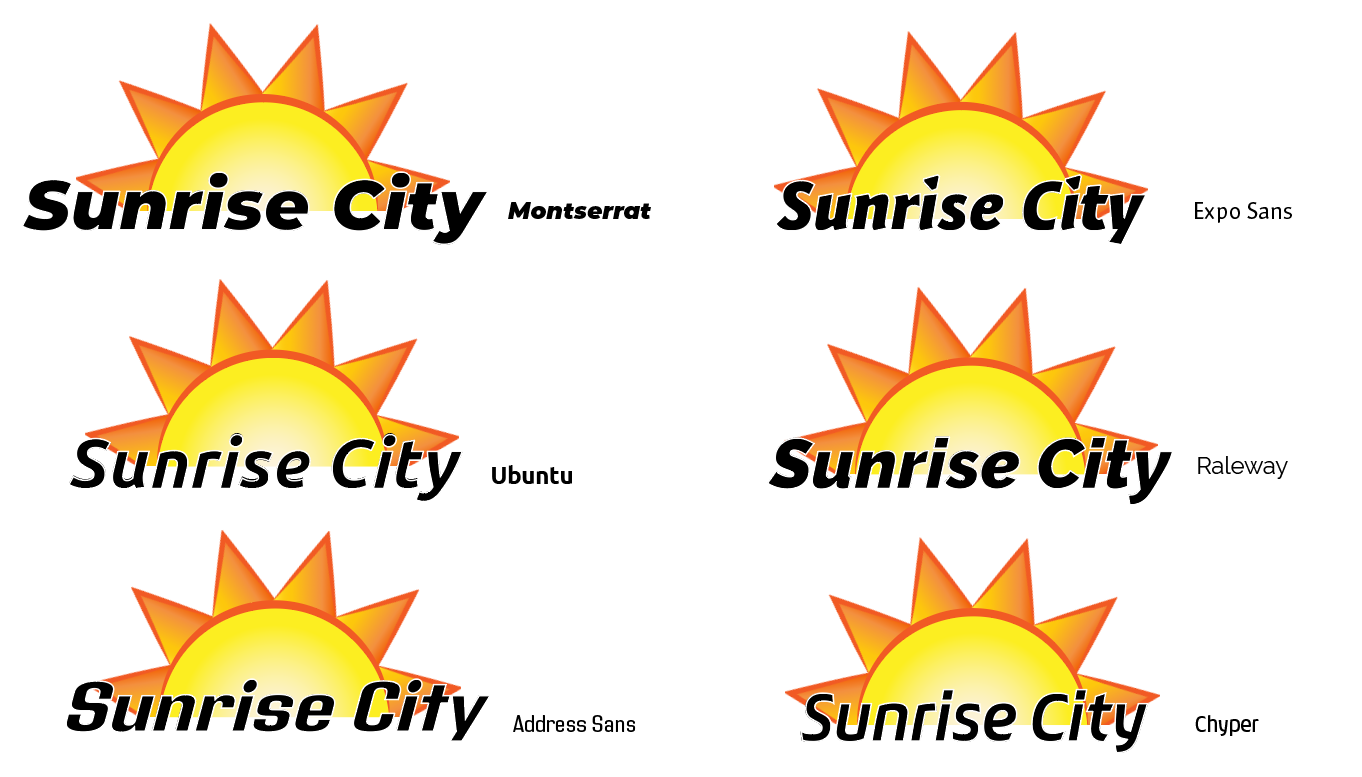
The most recent changes to Sunrise City have been focused on visual design as we tightened up the gameplay. Specifically, we’ve revamped the game’s logo and typefacing. It took a while to find a pair that best fit our desired aesthetic while maintaining readability. Our original board had several differences in both fonts and formatting, resulting in a more cluttered look that drew attention away from the game. By streamlining the typeface, the board and cards will be less visually fatiguing, allowing players to more easily understand mechanics and state of play.
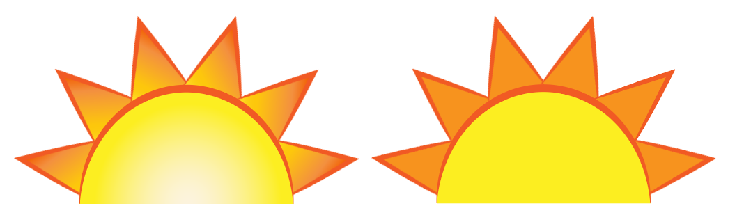
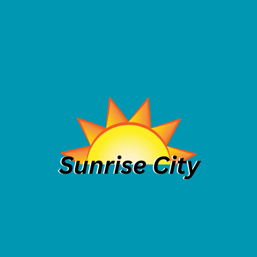
Now that we’ve settled on a name, the logo for Sunrise City has also been revamped. With the logo, we decided on a simple sun design with the title beneath it. We wanted something easily understood and evocative; it was a fine line to walk between simplicity and abstraction. We arranged the colors in a dark-to-light gradient with the lightest colors on the insides of the shape to be more visually interesting than a flat and solid color; we ended up using six triangular rays on the sun because it felt the most balanced without being distracting. For our title’s font, we wanted something strong that complemented our logo’s simple design, and we decided to use a sans serif font to boost the modern flair of the game. Exo/Source Sans Pro fit perfectly— the stylized design synergized well with our sun. With combination, Sunrise City has a warm look that inspires hope, much like our sustainability goals should.
Additionally, we created a design for the previously mentioned political unrest meter. It gives a clear visual indication of its effects: the amount of funding available in each City Hall meeting fluctuates depending on the players’ previous actions. This works well with the social strategy aspect of the game; if unrest has increased, players are forced to work with less funding and have to decide what outcomes need to be prioritized. Additionally, this seems to have brought out a competitive edge in many of our playtesters who have shown a surprising amount of competitiveness for a cooperative game. Less funds mean higher tension but also keeps players grounded and involved. This makes it even more rewarding when the funding eventually increases and then encourages the cooperative points of the game we wish to push.
Leave a comment
Log in with itch.io to leave a comment.